Website design trends or just even web design revolves around looking to the future and following technology trends. This is mostly because of its strong relationship with technology, the digital world is often a showcase for every new innovation; animations, interactive technology, digital creativity, etc. and this gets wider and better each and every year. And 2022 website design trends aren’t left out, as we will soon discover in this article that highlights the common website design trends.
One of the most common themes among these trends is motion design. Gary Simon, an experienced and skilled UX designer believes motion design is the most trending of the website design trends. The 80s and 90s design trends are currently making a comeback. Design styles like typography and live animation. Not to talk much, let’s look at the website trends
Here are some website design trends that have dominated this year.

Memphis design
Memphis design is one of the defining aesthetic design trends that dominated in the 80s. It is also sometimes thought of as a gaudy design style which pairs multitude of chaotic design patterns and shapes together. In the 80s, Memphis design trends were seen as a rejection of minimalist design and were the supposed high tastes of the design and art critics, which made most designs in those days simultaneously more colorful, approachable and adventurous than usual.
The Memphis design trends are back, as designers are no longer scared to embrace colors with the fear that “it may be too much”. UX designers now add more colors to design projects to create a vibrant and exciting emotional connection with users.

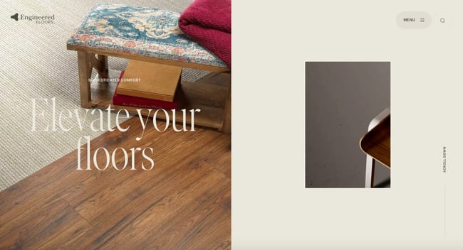
Scrollytelling
Scrollytelling is part of design trends which are evolving and popular means designers use to leverage digital interfaces and convey an intricate story. The scrolling effects can often stimulate visitors and encourage them to keep scrolling through that page.
The visual effects strive to grab attention and captivate users, serving them exciting and engaging content.
Scrollytelling which is also referred to as “narrative visualization” contains a series of visual elements which are carefully sequenced together and organized chronologically in order to convey a specific message to visitors.
Statement Typography
The Typography Statement are design trends used to make a statement. It is created as the first part of a web page that visitors see, the content has to be bold and has to make a statement. UX designers in 2022 are taking that idea to heart with typography statement hero images.
Essentially, these bold typography sections often reduce or eliminate other contents altogether to allow the main statement or message itself to carry the weight of the first impression. These sections are usually bold and simple, and the goal is for them to command attention and captivate the website visitors even in their simplicity. And while they do that, they also provide a great showcase for some stylish, tasteful and creative lettering styles for the designer.

Kinetic Typography
Kinetic Typography which can be called Motion Typography are part of design trends aimed to capture attention and delight your visitors while helping them digest your content.
The kinetic typography is an animation technique that has been in use since the 60s when feature films started using animated opening titles. The typography style can also be used for a similar purpose in design. It can be used to instantly grab the visitor’s attention once they land on the homepage.
It can be used to showcase the designer’s artistry and also highlight important sections of the product, help to guide visitors as they scroll, and gradually reveal important information,
An example is Arcadia.
Visible Borders
Ux design likes to create a sense of magic, well, at least the illusion of it. It tends to create the impression that the content is well arranged by a certain invisible hand and floating in freeform in a digital space. Well, the reality, of course, as we know is that websites are generally built on a grid and joined together with several codes. In 2022, one of the design trends is where UX designers continuously try to get a little more realistic with design layouts that reveal their foundation through borders and frames.
A grid that is visible has the benefit of differentiating one section of the design from another which makes the web pages easier to navigate while also giving room for more content without the page feeling crowded.
Ultra Minimalism
Recently, UX designers are defying the conventional ways people expect a website to be or how they expect designs to look like. The minimalist design trends tend to create a certain experience which is believed to be distinct. Designers display just the absolute necessities of a product.
An example is a website from designer Mathieu Boulet which is mostly centered just around a few choice links to their social profiles and important information.
-Oct-06-2021-08-53-34-47-PM.png?width=650&name=Update%20website%20design%20trends%20(heavy)-Oct-06-2021-08-53-34-47-PM.png)